“Yamato Glue Bottle” is awarded as TOP3 of “TOPAWARDS ASIA 2ND ANNIVERSARY GRAND AWARDS”.
“Yamato Glue Bottle”of starch paste glue, one of Yamato’s long-selling products, is awarded as TOP3 of “TOPAWARDS ASIA 2ND ANNIVERSARY GRAND AWARDS” after awarded as package design award of “TOPAWARDS ASIA” last year.
Topawards Asia is a monthly design award exclusive for packaging sold on the market within Asia. Designs are gathered from around the continent from a consumer perspective, and are judged by renown design professionals.
The theme of August 2017 was “nostalgia”. As “Outstanding in Form” award in “others” category, “Yamato Glue Bottle” was awarded.
For the 2nd anniversary, 10 judges were invited to round up the very best out of the 152 works featured through Topawards between April 2017 to April 2018. The goal of the Grand Awards is to identify three works that stand out from the rest, and reflect our ideas on what packaging could be more like in the future.
“Yamato Glue Bottle” was awarded as one of the TOP 3 winners.
The key selection points and judges’ comments are the followings;
■The key selection points
Creativity & Inspiration
The design is unique and original, exploring a new concept, excelling in communication and storytelling, and looks to creating a better future in packaging.
Social Responsibility
The design creates an emotional and functional experience, whether it is fulfilling a certain need or improving the wellbeing of the user.
Experience
The design looks to either use materials or processes responsibility, truthfully communicates the product within, or is committed to improve the relationship between the product and user.
■The judges’ comments
Ken Lo, founder of BLOW in Hong Kong
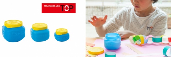
This glue bottle is very cute. The yellow and blue colour are memorable and strong. I like the blind embossing effects for the whole packaging, which makes this design with more personality and details.
As this packaging is for a glue, I think this design approach is very appropriate, it looks basic and you will love to have this cute bottle on your desk.
Noritake, Illustrator in Japan
The vivid blue brighly comes into your perception.
The yellow lid also makes one feel like opening the product.
If this was in a child's tool box, I think it will surely make them want to make something.
■“Yamato Glue Bottle”
"Until the 1950s, starch pastes were sold in glass containers, which was inconvenient because of its heavy weight and tendency to crack.
To solve this inconvenience, a plastic container was used — for the first time ever — for glue. The container is light and unbreakable, and easy to handle. A tube container was first used, and the bottle form adopted in 1958.
With a change in time and listening to the needs of the customers, the good sense of touch, its good appearance and soft image, as well as the functions of the lid were considered to incorporate a new air to the design in 1980, resulting in the current form of the bottle.
The yellow lid and blue body that has been used since its first launch inherits the Yamato glue that was in its glass bottle, imagining the blue of the glass and the golden lid used.
Under the initiative of the president at the time, the designs were carried out with thorough consideration within the company."
Find out more on: https://www.yamato.co.jp/english/ or YAMATO Facebook
Detail
“TOPAWARDS ASIA 2ND ANNIVERSARY GRAND AWARDS”